I’ve been doing these daily updates on my facebook: http://www.facebook.com/modesto
I thought I’d share what I wrote today. I think today is somewhat of a landmark day as we continue to flatten the curve for this Coronavirus infection. Maybe we’re at that mystical peak? But then again, how many peaks are we going to have? So this may be the peak of the initial phase where we are staying at home.
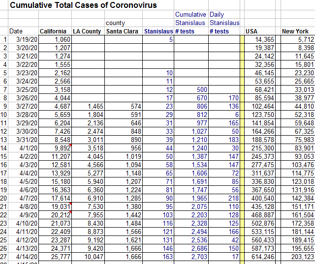
We are bending the curve as based on initial forecasts that I’ve done with my graphs. Today is our 27th day of social distancing in California. I started counting 3/19/20 as our first day when California’s Governor, Gavin Newsome issued a stay at home mandate. So it’s almost a month! Today California passed the 25,000th case of COVID-19 as captured by testing. Using original projections, I had predicted reaching 25,000 cases on 4/9/20, but we didn’t hit that number till 4/14/20 – 5 days later! So that’s a flatter curve! LA county surpassed th 10,000 mark. Santa Clara county didn’t seem to update their numbers for today. Stanislaus county which is my county where Modesto resides reports 163 cases with 4 deaths, and a total of 2703 tests done. Today registers 17 tests done in the past 24 hours. I would have personally liked to have seen more tests done, but there are just so many constraints – it’s easy to wish for more tests and hard to implement. USA has now broken in to the 600,000’s of cases diagnosed of COVID-19, and New York, my birth state reports over 200,000 cases for the first time today. I wonder when we’re going to get re-opened again, and I do like the public wearing of masks idea even when we re-open and get back to work for those that have been staying at home. Does anyone have any ideas on when we should re-open.
This data is and commentary is from 4/14/20
Visit links regarding COVID-19 and Coronavirus here.


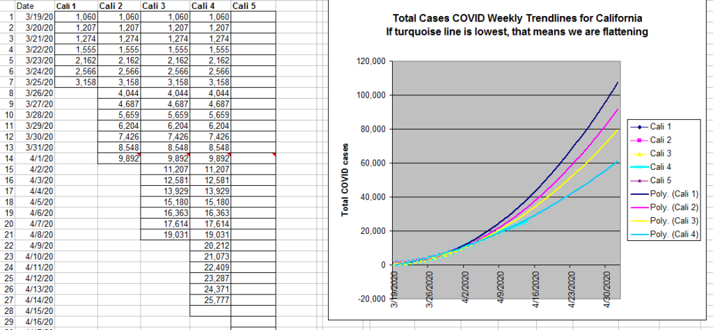
This second picture (above) with the graph shows 4 trendlines for California. Each one is a polynomial distribution of the 2nd order based on data from the 1st week, then data of information added for each successive week. Each week shows a “flatter” curve for my forecasts which I did in a 2003 version of Excel. This was proof to myself that we are flattening the curve for California. You can sort of think of each line as 4 weeks separated from each other, recalculated as new data comes in.
How do we know if we hit a peak?
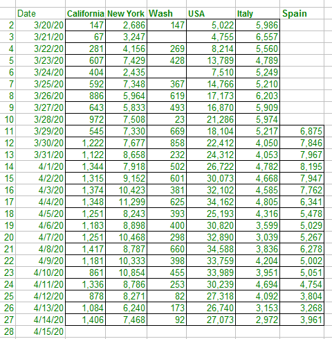
We would know if we looked at the changes each day – meaning we looked at the new cases discovered each day of COVID-19. Perhaps we hit the peak soon and the numbers start to come down. It would be nice to say that perhaps tomorrow we hit 1500 new cases of Coronavirus infection and then after that the numbers of new cases start to come down and down, until we reopen…

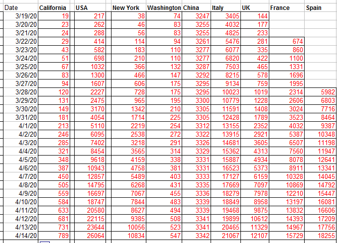
And finally below this text, I rarely post this, but it’s time to do it. This is the death chart. These are family members, friends – not just statistics, so it’s hard to post So below is the total cumulative number of deaths from COVID for USA, California, New York and various other places. They are mothers, fathers, sisters, brothers, children, patients, and colleagues.
